We recently upgraded from Microsoft Office 2003 to Microsoft Office 2007 at work. Clearly Microsoft has put a lot of effort into upgrading the UI in the various components of Office 2007. For those who have not seen Office 2007, this is a snippet from MS Word 2007.
So, gone are the various formatting, editing etc. toolbars that have been a mainstay in the UI for several releases. They have been replaced by “The Ribbon“, which in reality is just one big honkin’ set of toolbars accessed using the Home, Insert, Page Layout etc. menu titles.
Gone too is what has been probably the single most consistent interface element of GUIs, traceable back to the original Macintosh:
and the Apple Lisa:
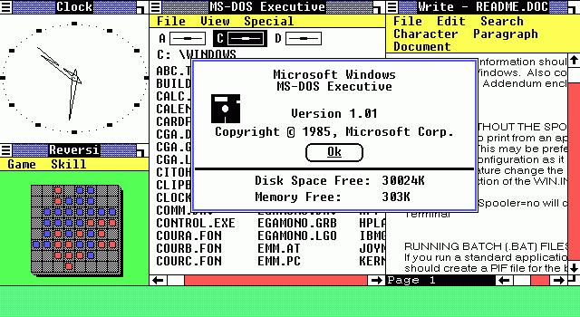
So what was that interface element? It was the File/Edit menu structure. You can see it’s origins in the Lisa interface. Pretty much every general purpose GUI application since the advent of the Macintosh, and certainly from the time that Windows 1.0 came out, had that. That was over 20 years of UI consistency.

Windows 1.0 screenshot
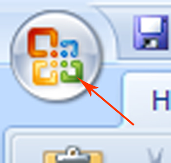
 In Office 2007, Microsoft decided to remove it. I have no issue with changing something like the File/Edit menu structure, IF they found a better paradigm or mechanism to replace it with. But the reality is that they’ve simply replaced the File Menu with the “Throbbing Orb”, or should I say the “Microsoft Office Button“.
I refer to it as throbbing, or perhaps pulsating may be a more appropriate adjective, because when I first launched Word 2007, that button was pulsating. I actually ignored it for several minutes, looking for the “File” menu. I wanted to open a document. How difficult should that be? I clicked on all the headers of the Ribbon — Home, Insert, Page Layout etc. — but couldn’t find the thing I needed most — File->Open.
Now I’ve been using software for a very long time. The first Word Processor I ever used was on a Wang 2200 computer. I’ve used WordStar (on CP/M and DOS), Multimate (I’m embarrassed to admit), Wordperfect on DOS (and unfortunately also on Windows — what a horrible product that was), as well as many versions of Word. So, when I sat there dumbfounded unable to find the equivalent of File->Open, I asked one of my coworkers for help. He came over and said, “Click that thing”, pointing at the Office button in the top left of the screen. This is what happens in Word when you click that button:

I immediately thought “What the *&@#?” Why would they do that?
It actually makes no sense to me to design something like this. Why not simply create a File title as part of the Ribbon and put the icons for all these things there? I have to guess there was some internal push by the marketing team to create the Office button for some sort of branding purposes, or perhaps there is some particular IP issue being addressed.
I don’t know, but I really wonder who made such a design decision and why? It’s completely inconsistent with the rest of the interface, confusing for new users, and yet so deliberate in it’s implementation that I’m sure there must have been heavy debates in the Office UI team when deciding to implement it.
There is evidence in the Word (and other Office tools) GUI that the toolbar/no toolbar debate happened within the UI team. After using the Office button, I noticed the little toolbar right at the top of Window with several of the “old” icons such as Save, Undo, Redo etc. Seems like a clear “hack” to appease the more traditionalist camp that insisted on toolbars, or perhaps a clear realization that users needed an easy way to perform basic tasks. I think the folks at Microsoft should remember one of the key axioms of Product Management:
Change is a process, not an event.
Anyone have any insights into the Office 2007 design process at Microsoft ? If so, please share.
Saeed
P.S. Apparently there is enough of a market opportunity for the “old” Office interface, that a 3rd party company has created a product to give that to users.


