Tweet this: Simplicity and Elegance Require Deep Attention to Detail – http://wp.me/pXBON-2Wh – #prodmgmt #design #innovation
By Saeed Khan
There’s a mantra these days (or does it qualify as a meme?) in product design that simplicity is critical and complexity should be avoided. The KISS principle — Keep it simple stupid – has been around for a while, but clearly in the last few years it’s come to the forefront of design thinking.
When building software products, simplicity does not mean simplistic. Simplicity in design requires sophistication in thought.
There is great tension between what’s easy to do and manage with technology, and what’s easy to do and manage for the user. Unfortunately in many cases, the former wins out over the latter.
I was recently talking to a friend of mine who was working with a database application. He had to write some reports using data the application had stored. Without getting into gory details of the database schema, let me say that the application was a job/task tracking application and amongst other things, for each particular task, it stored the time when the task started and the time when the task finished.
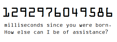
My friend needed to aggregate the total time taken for certain tasks and write out the start/end times of various tasks in a report for someone to read. Now here’s the kicker — all times stored in the database — including task starting and ending times — were stored as milliseconds from January 1, 1970. By the way, the application itself is only about 3 years old.
He told me that he had to write some funky SQL to convert those times to something human decipherable. I asked him if he knew why the data was stored that way. He said he had contacted the developers of the application and was told that not only was this a standard way of storing date/time info (Unix Time?), but given all the data/time formats and representations out there, they couldn’t know what people wanted so they gave the users “freedom” to choose.
I had to smile at this last sentence – they were giving the user the “freedom” to convert a millisecond date/time value to any format they want. This example, in fact, illustrates simplistic thinking and a complete ignorance to detail. It focuses on coding to the machine’s bias and placing a burden onto the end user.
Designing for the human
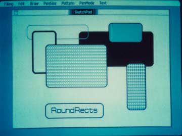
 A great counter-example — and here’s a mandatory Steve Jobs story — is an incident that is generally known as “Rounded Rectangles“.
In short, back in 1981, when developing the code to draw graphics for the original Macintosh, Bill Atkinson wrote some code that very quickly drew arbitrary circles and ovals on the screen. OK, for those of you young folks, this may not sound like it’s anything significant, but 30 years ago, with CPUs that completely SUCKED at any floating point arithmetic, this was a feat.
NOTE: Remember, plotting circles normally depends on formulas using pi or trigonometry (sin or cos of an angle), both of which require decimal calculations.
When Bill showed his circles and ovals to Steve Jobs, Jobs’ response went something like this: That’s great, but can you draw rectangle s with rounded corners?
Atkinson was taken aback. First, that would be hard to do. And second, why would anyone care about rounded corners on rectangles?
Jobs’ responded that rounded rectangles were everywhere, and to prove it, took Atkinson for a walk outside. During their walk, amongst many examples of rounded rectangles, they came across a no-parking sign with rounded corners, and Atkinson was convinced. He said he’d give the problem some thought.
The next day Atkinson came back and demoed blazingly fast rounded rectangles being drawn on the screen. And today, 30 years later, if you look around any computer screen, you’ll see rounded rectangles everywhere.
OK…and so what?
In reality, neither time in milliseconds nor rounded rectangles on their own are going to have a huge impact on any given product. My friend wrote his funky SQL and converted the times as needed. And whether a dialog box has rounded or square corners, it doesn’t directly change the functionality of an application. But each does have a small impact on the product by increasing or decreasing the burden on the user to extract value from the product.
Now imagine corporate cultures where each of these examples are applied repeatedly for a given product. i.e. one product is consistently designed for the machine. Another product is consistently designed for the human. What would be the end result?
In both you’d have a functional product. With the former, you’d have a product with a lot of rough edges and a lot of knowledge needed by the user to be effective with the product. With the latter, you’d have a product that is distinctly different from it’s competitors and a pleasure to use.
User’s wouldn’t always be able to enumerate why the latter was great, but they’d certainly tell you which one they wanted to use.
And why would that be the case? Because the designers of the latter application paid really close attention to all the fine details. It’s about a culture of craftsmanship. The rounded rectangles story changed Bill Atkinson’s view of what was needed, and also what could be done with graphics on the Mac. It’s no surprise he wrote MacPaint (a killer app for the Mac) a few years later.
Now, getting back to the two divergent applications. Which application would you want to use? Which application does your company usually build? Why?
Saeed
Tweet this: Simplicity and Elegance Require Deep Attention to Detail – http://wp.me/pXBON-2Wh – #prodmgmt #design #innovation
