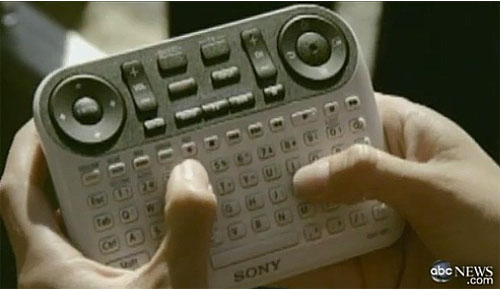
Steve Johnson has a great post entitled They’ve seen an iPod, right? about a new remote control from Sony for an internet TV product. This is it below. I kid you not.
 After reading his post, I couldn’t help but think about another similar absurdity. This is the so called “Open Office Mouse” from a couple of years ago. Anyone remember this one? I totally love that plunger thing on the side!
What’s remarkable about both of these is not simply the ridiculous number of buttons, but by their design, it’s clear that the creators of these devices made them in a bubble, devoid of any understanding of who would use them and why.
These two devices tie directly back to the previous post entitled When form doesn’t follow function.
It’s amazing to me that given how much we know technology and the drive towards simplicity, that products like these still make it to market.
Saeed
